This is an opinion article. Any views expressed belong solely to the author and are not representative of The Cluster, any organizations the author is a member of or the faculty, staff or administration at Mercer University.
Banners plastered houses down Greek Village for this year’s Interfraternity Council rush season, and they are as IFC-esque as would be expected. The fraternities certainly do not embrace themes the same way sororities do – they typically only present a banner – but someone put time into getting each one prepared for this year's bid day. My judging criteria is based on the banners' execution and their concepts, of which there was a wide range.
Phi Delta Theta: 4/10
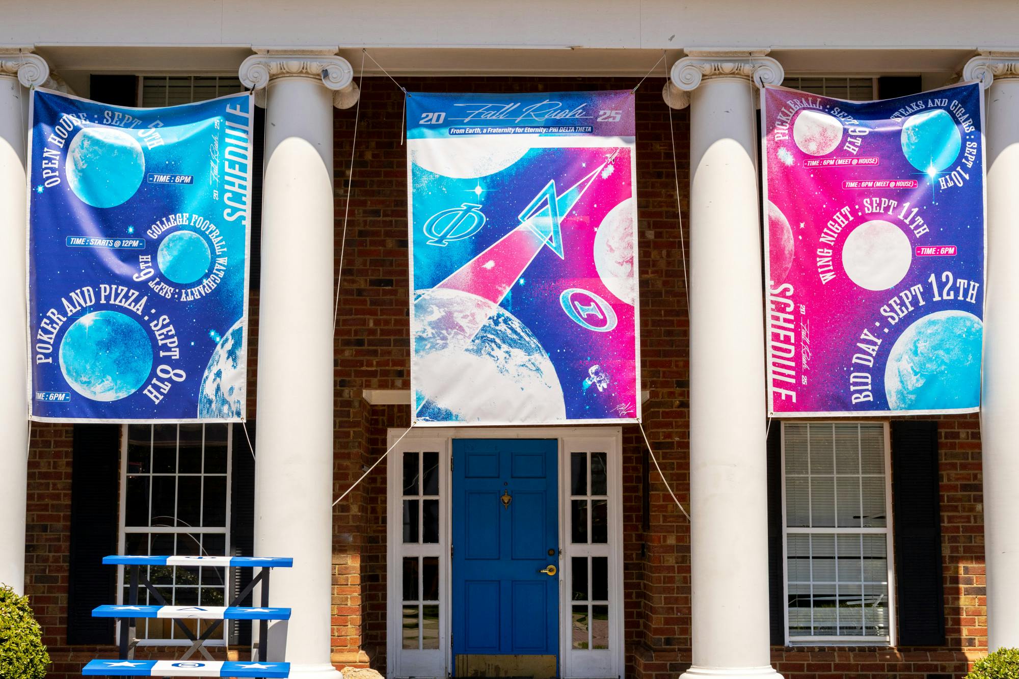
The Phi Delta Theta house in Bid Day 2025 theming on Sept. 12, 2025.
“A Fraternity for Eternity,” was Phi Delta Theta’s catchy –if a little cheesy – slogan this year. They chose an intergalactic space theme, including an atmosphere with cosmic formations in the shapes of their Greek letters. The idea is not bad, but the execution left a lot to be desired. What did stand out was the number of banners. Phi Delt hung up three as opposed to the other fraternities’ single signs, which was eye-catching and gave their house more presence. However, their banners were screen-printed instead of hand painted. Boooo. The printed banners do not show the same care and attention to detail as the painted ones, even if the design looks good. Unfortunately, the planets were kind of muted in color and did not stand out like they could have. The planets showcased the daily rush events, which was creative, but the words were wrapped around them, making them hard to read. Space might have zero gravity, but on Earth, we cannot turn upside down. Did they blow it out of the atmosphere? Not this year.

The Kappa Alpha Order house in Bid Day 2025 theming on Sept. 12, 2025.
Guess who is back in town? The Kappa Alphas and they are letting everyone within cannon shot know! The theme, “The Boys Are Back in Town,” is a reference to the song by Thin Lizzy. I think it is a fun, lighthearted concept — especially considering the people on the banner appear to be the chapter’s founders. My biggest issue? The banner is too small. I am not sure if it was intentional or a fluke, but the awkward sizing and excessive red border on the bottom distract from the logo itself. Similarly to Phi Delt, I wish this banner was painted instead of printed because it would have made it more personal and creative. I do like that they stuck to their color theme with the bright red and gold. In the end, solid idea, but the execution fell a little flat. The boys may be back, but the banner is too small to really spread the news.
Sigma Alpha Epsilon: 5/10
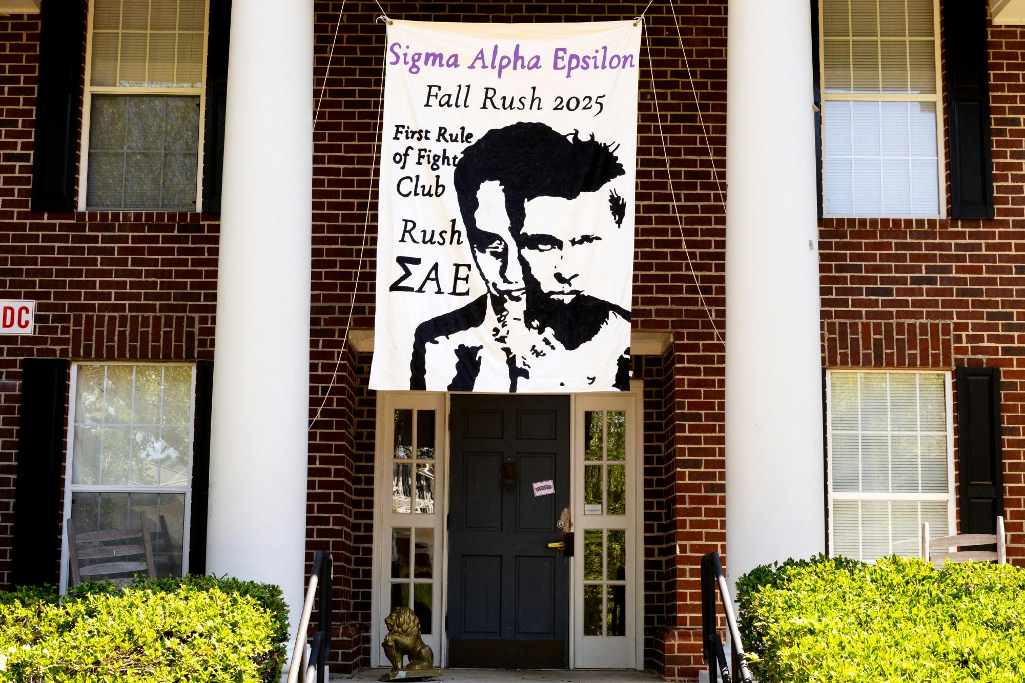
The Sigma Alpha Epsilon house in Bid Day 2025 theming on Sept. 12, 2025.
First rule of fight club? Rush Sigma Alpha Epsilon, apparently. I wonder if the second rule is to not to talk about SAE? This might be hard given most members of a fraternity seem to only own T-shirts with their chapter's logo. The concept is fun — especially since "Fight Club" is definitely a top-10 frat boy movie. The banner itself is pretty simple: black and white with their name in purple at the top. Honestly, I wish they had either committed to full monochrome or added more color because the single splash of purple feels a bit out of place. The portraits of Brad Pitt and Edward Norton are solid, and I like the size and placement, but they muddle together a bit at first glance. Then again, that might be the point, considering the plot of the movie. Overall, it was a fun idea, but I am not sure it was a knockout.
Pi Kappa Phi: 6/10
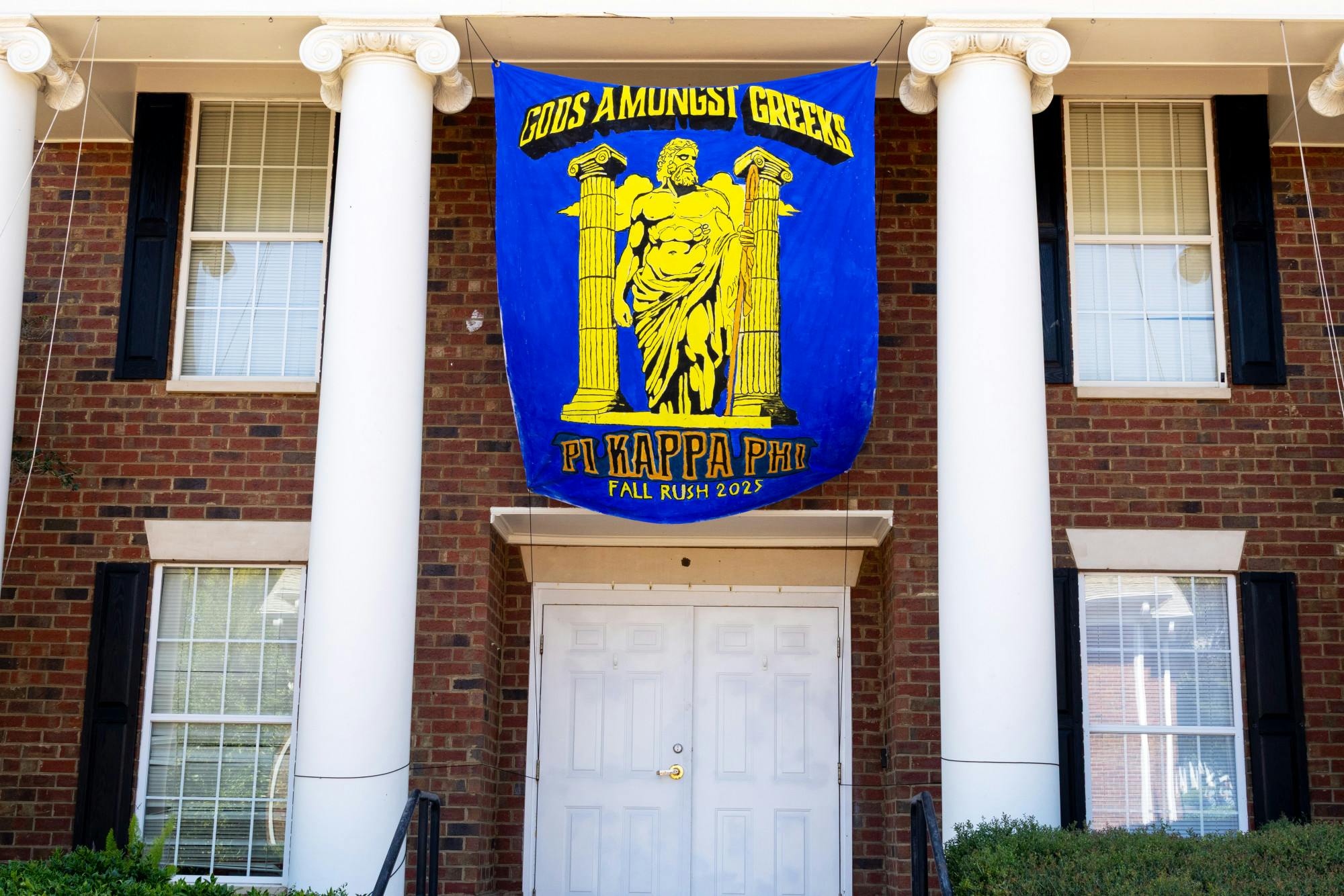
The Pi Kappa Phi house in Bid Day 2025 theming on Sept. 12, 2025.
Hello, Neon! I do not know where Pi Kappa Phi bought their paint, but it must have been from Mount Olympus itself — I doubt I have ever seen colors so bright. The striking nature of their banner fits well with their theme, “Gods Amongst Greeks.” But the concept itself is a little basic. I feel like fraternities always lean on some type of 'Greek' theme, but a classic is a classic. The design itself was strong, and I liked the way they organized the layout. The theme name across the top reminded me of a superhero logo, which worked with the boldness of the piece. I do wish they had used some more colors in the image of the God, I think it could have popped more. They also had some white spaces peeking out of the sides, which was unfortunately noticeable against the electric blue of the rest of the banner. Overall, their theme was godly, from bold colors to being larger than life.
Alpha Tau Omega: 7/10
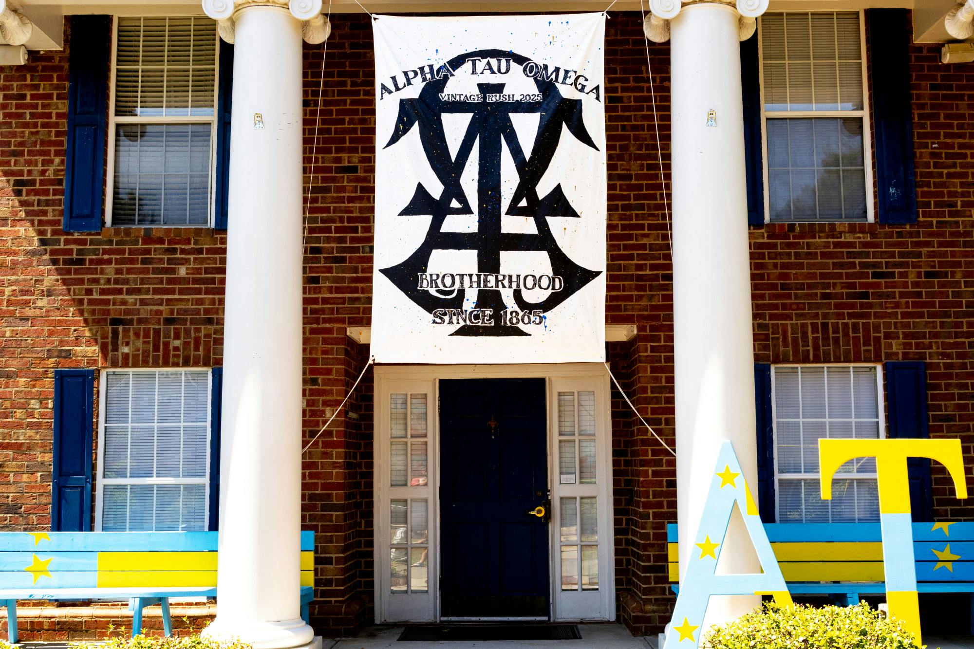
The Alpha Tau Omega house in Bid Day 2025 theming on Sept. 12, 2025.
Simple and classic are the first words that come to mind when looking at Alpha Tau Omega’s theme. Their 'vintage' idea did not really come through in any obvious way, but the banner itself looked sharp. The letters were layered on top of each other in a clean, bold font, and the subtle splatter of paint gave it some extra personality. They also had a distressed look to the lettering, which incorporated the 'vintage' feel. While some might say it is plain, I think it works well. The banner is clear, recognizable and stands out — which is impressive considering it is mostly black paint on a white canvas. Sometimes less is more, and I think their minimalistic approach paid off. While I am unsure how 'vintage’ is supposed to translate to a frat rush poster, the banner looks good, and that is what counts.
Sigma Nu: 7/10
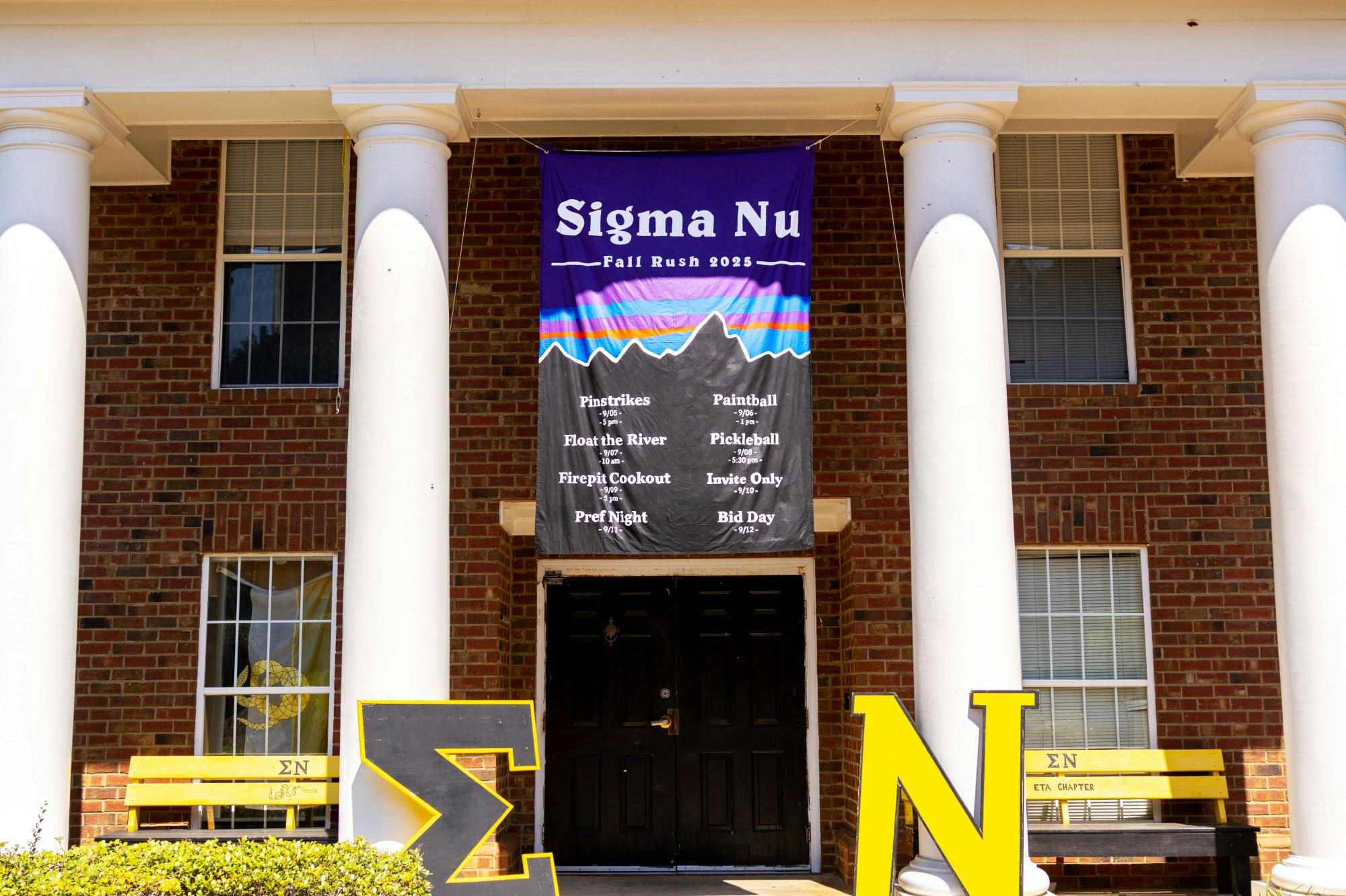
The Sigma Nu house in Bid Day 2025 theming on Sept. 12, 2025.
The Patagonia theme did not make a ton of sense to me at first, but I cannot deny that the banner looked amazing. The logo is instantly recognizable with the color scheme and mountains, and the paint job itself was really clean. The white lettering stood out nicely against the background, and the whole thing popped from a distance. I also have to give them credit for how they used the empty space — they listed their rush events on the banner, which made it useful in addition to being decorative. It gave the design a polished and purposeful feel instead of just being a pretty picture. The theme might be a little random for a fraternity rush, but I thought it worked in its own way. I wonder if I will think of Sig Nu every time I see any Patagonia merch.
Beta Upsilon Chi: 8/10
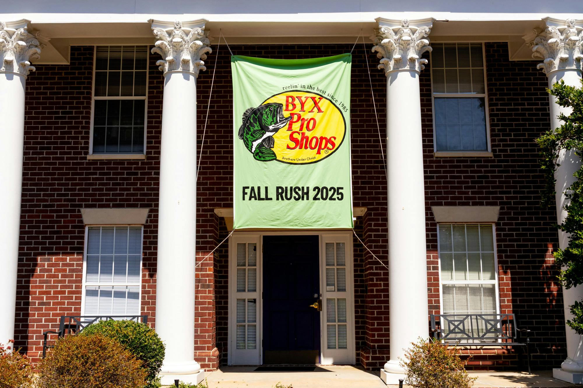
The Beta Upsilon Chi house in Bid Day 2025 theming on Sept. 12, 2025.
Bass Pro Shops is peak fraternity material. After all, camouflage and fishing fit well with the unmistakable 'frat flicking' that is ubiquitous at parties. But honestly, they pulled it off wonderfully. The caption, “Reeling in the Best Since 1985,” is clever, snappy and fitting since I am pretty sure every single Beta Upsilon Chi has at least one Instagram post of them proudly holding up a fish. But the real winner is whoever painted that banner. It pops with bright colors and clean, sleek lines – so clean that I nearly had to go up and feel it to make sure it was painted. Whether it was done by an impressively talented brother or a fraternity sweetheart, I hope they get the applause they deserve. My only qualm will be if one of their rush events was not going fishing. If you are advertising a Bass Pro rush, you have to go all in.
Lambda Chi Alpha: 9/10
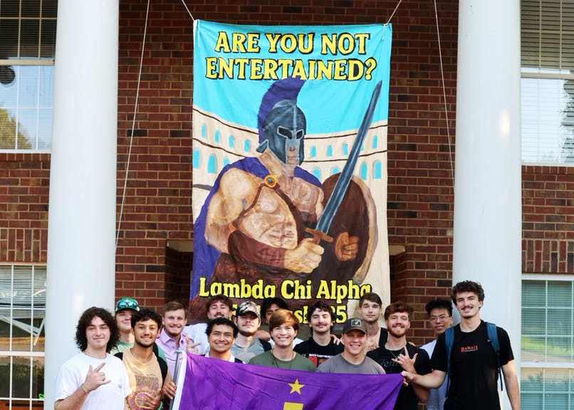
The Lambda Chi Alpha house in Fall Rush 2025 theming on the week leading up to Bid Day on Sept. 12, 2025
Lambda Chi Alpha really went all out, starting in ancient Rome and ending in "Lambdaritaville." They are the only frat to have a different rush and bid day theme. Ambitious? Definitely. Effective? Absolutely. Starting with the gladiator rush banner, the slogan “Are You Not Entertained?” was cheeky and fit the energy of the week. Sure, gladiators as a concept is a little basic, but the execution was impeccable. The banner looked amazing — packed with color, lots of details and a gladiator that actually popped instead of fading into the background.
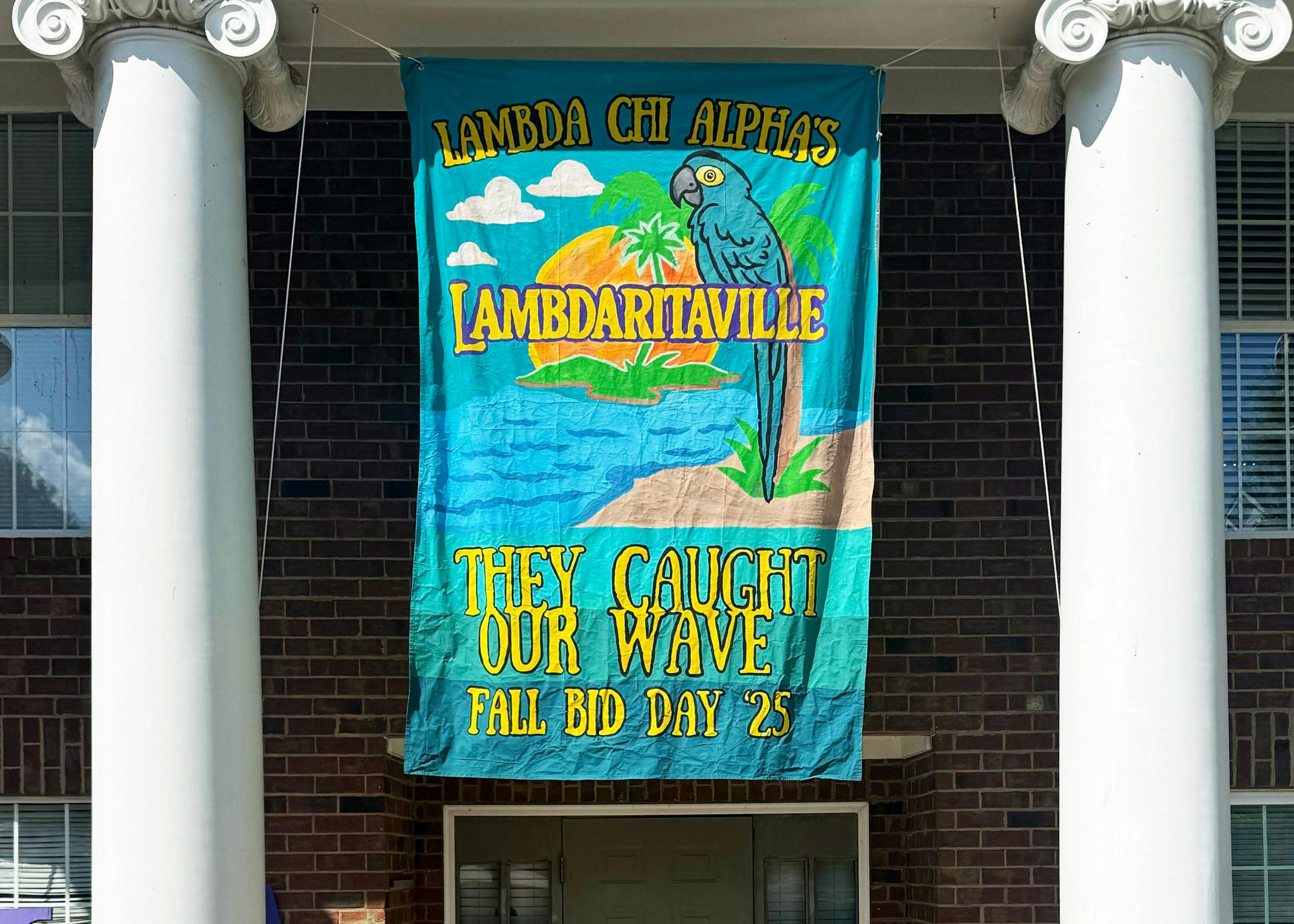
The Lambda Chi Alpha house in Bid Day 2025 theming on Sept. 12, 2025.
Then came bid day, and suddenly it felt like we were on the beach. “Lambdaritaville” is such a unique pick, and I really love it. The banner was vibrant, tropical, and fun — complete with the Margaritaville logo and a parrot which tied it all together. Friday's slogan, “They Caught Our Wave,” is not my favorite, but I see the vision. My only issue is that the two themes do not really coordinate with each other. The jump from the Colosseum to cocktails is a little jarring, and I wish they had connected the concepts in some way. Still, overall, I cannot deny that I was very entertained.